
The Good Brand Checklist No.5
No.5 - A good logo that we use consistently.
This is important. A logo is not the brand, it’s just an icon, artwork, symbol or word that represents it.
As the Cross represents Christianity, your logo represents your brand.
Once your brand and logo are established a customer sees the logo but the brain registers the brand behind it.
Nevertheless a good logo is important.
- It should be technically correct, as simple and iconic as possible.
- It should be easily reproducible on a range of different media, but in particular on your product or wherever you deliver your service.
- The most important element of the logo is typically the logo text or “word”.
- It must be legible and pronounceable. The overall logo lockup is typically a mix of letters, shapes and colours.
- It should be should be unique and distinct.
Once you have a good logo, it’s most important that you use it everywhere, consistently and that you resist the call to tweak and change it.
Attributes of the ideal logo
The ideal logo should:
- display the brandname as text
- favour legibility over style
- work well in one or two colours
- be vector based (easily resizable without loss of quality).
- be horizontal (as close as possible to 2.25 x 1 proportions).
- be the opposite colour of your competitor(s)
The Kellogg’s® logo is a great example displaying a number of these ideal logo attributes.
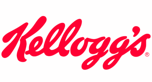
Kellogg’s logo
But what about the Swoosh?
You might be looking at the simple ideal logo attributes list, above and wondering about famous brands you know. Some of those brands don’t necessarily follow these basic principals.
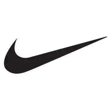
The Nike “Swoosh” logo
One of those is Nike® who moved to use the Nike Swoosh as their primary logo.
There’s no doubt that Nike are a succesful brand and they had their reasons for making that decision. However Nike have also spent a lot of money and time, ensuring that people understand that the Swoosh is shorthand for the brand “Nike”.
You probably don’t have that luxury for your brand.
Do this simple exercise.
Look at the logo above and say back to yourself the brand name.
Did you say “Swoosh” or “Nike”?
It should have been “Nike”.
The most important thing is your “name”. Your name is what people see, repeat and remember. It’s the name that has meaning in the minds of the customer, not the symbol.
So unless you have a Nike sized marketing budget — you better make sure your logo has your name in it.
My logo sucks, Should I change it?
Sometimes you may feel that your logo is out-of-date, old fashioned or just plain ugly. You feel like a change and the agency is pushing you to let them come up with something new.
What do you do?
You have a very close relationship with your logo. It’s easy to tire of it and want something new. We all like new right?
However, it’s really important to recognize that most of your customers are not so close to it. Your logo doesn’t fill their day, like it does yours. Instead it’s fighting with hundreds, thousands, even millions of other logos for recognition.
Remember a logo is shorthand for your brand name, so the most important aspect of a logo is it’s ability to be recognized, NOT its aesthetics or design.
Therefore, if your logo is established, in most cases you should NOT change your logo.
But there are exceptions. It’s OK to consider changing your logo when:
- You’ve changed your business significantly (e.g. a merger) and want to signal to the market that there has been a significant change in your offer.
- There’s a legal problem with your current logo.
- You’re entering new markets and there are cultural issues with your current logo.
- There are mechanical problems with applying your logo to your products or services.
- People have trouble associating your logo with your brand (e.g. it doesn’t have the name in the logo).
Do this (not so) simple exercise
If you’re considering a logo change, ask yourself:
- What is the return on investment from a logo change?
- If you spend $X on a new design, new Stationery, Uniforms, Signage, Brochures, Advertising, Rebranding product inventory, Forms, Website, Social sites not to mention explaining and communicating the change, will your return be greater than the sum of $X?
- If you spent the same amount on a new advertising campaign or on product development, or on market development, or on a new web presence, or on social marketing, would you get a better return?
- Consider any lost business or inertia as a result of customers not recognizing or trusting the new logo.
What happens if you don’t change it? Is there a quantifiable downside to the status quo?
There are no easy answers — but I suspect in the majority of cases, there is not a sufficient ROI to justify a logo change.
Sadly there are many cases where the desire for change for the sake of change, overides common sense and neither ROI nor respect for good branding practice, was considered when commissioning a new logo.
Don’t get me wrong, we love new logos. However, you need to be able to justify the need for one.
Still want a new logo?
Try a service like 99Designs where you can find a logo designer or run a logo design competition, at an affordable rate.
Remember the real value of a brand is the idea of it.
Initially the logo artwork has no real value. Once a brand is established and the logo has been used for some time, and is recognisable by the audience that you want to attract, the logo can become a valuable asset.
Check ?
If you can check this item off, pat yourself on the back. You’re on your way to a good strong brand.
If not, then your brand needs work.
Consider getting your team together, preferably away from your place of work to discuss and arrive at some conclusions. You need to be crystal clear and concise. Use simple, easy to understand language with no ambiguity.
Note: This is ideally an internal process.
Happy branding 😀
Thanks for reading, I’m David Vaassen, and I love and work with great brands everyday as a brand strategist and founder of brand management systems company e-see® and Brandkit®.
This article is no.5 in The Good Brand Checklist series.
p.s. I wrote this originally in 2014 but like most brand practices it still applies today.
The Good Brand Checklist No.5
The Good Brand Checklist No.5 — A good logo that we use consistently.