The 'B' icon.
The icon can be used on its own e.g. Twitter profile icon, but is normally used in conjunction with the wordmark, in one of the Logo Lockups seen below.


Brand name: Brandkit
Tagline: "Home for your brand"
Domains: brandkit.com, brandkitapp.com, brandkit.io, brandkit.co.nz, brandkit.com.au, brandkit.co.uk, brandkit.app
Our Mission: Make the world better, by helping every brand be an Authentic Brand.
Our Vision: Every brand has an easy to access library of authentic brand content to aid their story telling.
Our Core Values: Brands matter, People matter, Honesty, Authenticity, Trustworthiness, Simplicity/Less is more, Aesthetics matter, Respect the special uniqueness of each brand/customer, Be smart, Zag/Challenge the status quo, Value our own expertise
Brandkit's brand voice champions meaningful and honest communication, advocating for brands as essential guides in a world overflowing with information, with a focus on integrity and the power of storytelling to build trust and reputation.
It advocates for purposeful, honest communication and positions brands as crucial in navigating the abundance of information.
Brandkit's voice is thoughtful, advocating for quality and authenticity over quantity, and it underscores the significance of brands in establishing trust and reputation.
The tone is optimistic, affirming the positive role of brands and brand managers in creating meaningful, non-intrusive content.
The Brandkit® logo consists of the the 'B' Icon and the 'Brandkit' wordmark.
The 'B' icon places the letter 'B' (for Brand) inside a rounded square frame - intended to look like a molded "plastic model kit". This represents the concept of Brand Assets or 'content' being parts or components of a wider brand system, used to create a Brand Identity and wider Brand Story. The Brandkit wordmark is derived from the Museo Slab typeface. It can be produced in black or white only, depending on background colour (aim for best contrast).
There are 4 basic variants:
The 'B' icon.
The icon can be used on its own e.g. Twitter profile icon, but is normally used in conjunction with the wordmark, in one of the Logo Lockups seen below.
The wordmark
The wordmark is the brand name, 'Brandkit', with a registered trademark symbol, available as a vector and image file. It is always one word with the '"k" always in lower case.
Horizontal Lockup
For use in spaces with restricted height.
Vertical Lockup
For use in spaces with restricted width.
Brand has three alternative bylines, or straplines. These are:
Use as needed - but there you can also modify if needed to suit the situation. e.g. "Home for your photos", "Home for your brand content"
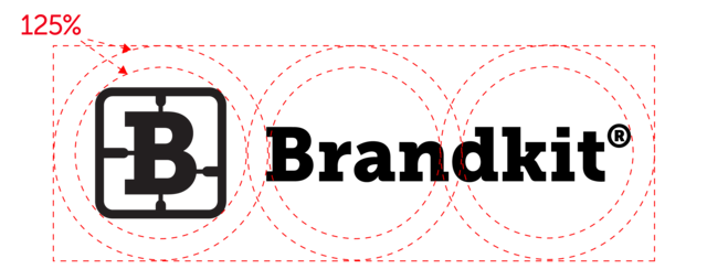
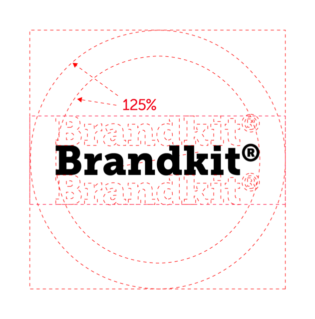
A minimum clear-space is required at all times.
For the icon on its own, a circle of 125% of a circle that intersects all 4 corners of the icon. For the Horizontal Lockup, draw another circle that intersects all 4 corners of the wordmark and expand 125% - then draw a rectangle that intersects the outer circles (as shown) to find the clear-space.
To make this easier to deal with, note that some assets for download have the correct clear-space built into the artwork or image canvas.
The general principal with use of colour at Brandkit, in particular in the Brandkit® application and default portal design, is as little colour as possible.
Why? Because Brandkit's job is to house the brand assets and colours of our customers. We want our customers content do be the dominant thing on the page. Therefore our branding, our use of colour must be subtle and unobtrusive.
So we use black and shades of black predominantly. We use Yellow and Purple for highlights and light shades of black, purple and yellow as backgrounds to provide separation between ideas for an easier reading experience.
However for marketing and advertising Brandkit® software or services in 3rd party channels, such as social media, we adopt a brigher more colourful approach and use the secondary Purple and Yellow more. For example we apply a Purple or Yellow filter over photography to given them a distinct look.
Brandkit is always written as one word, with an uppercase 'B', and a lower case 'k'.
(It should never be written as two words or with an upper case 'k').
Starting in 2023, to celebrate the launch of Brandkit 2, we have selected Inter, complimented by IBM Plex Serif, as our new typefaces.
Inter is a variable font family created by renowned Swedish designer Rasmus Andersson. The font was crafted specifically for computer screens to enhance the legibility of small text sizes. It was first released on August 20, 2017, and was initially known as Interface. It is also regarded as a "neutral" typeface, and a good match for our desire for the Brandkit® brand to be a neutral low key backdrop for each of our customers' brand and content. With our new monochromatic neutrality, we wanted to add a serif font to add a bit of interest to page layouts.
We selected IBM Plex Serif, because it is a perfect match for Inter with similar x-height, apertures and letter forms. As a bonus both are free fonts available on Google Fonts.
Change the way the world accesses your brand content.
Inter Semi-bold (600)Change the way the world accesses your brand content.
Inter Light (300)Change the way the world accesses your brand content.
IMB Plex Serif Medium (500)As a software product/service screenshots are one of the primary visuals we use to market and promote Brandkit. We've developed a standard style of screenshots with text and arrow overlays that we create with Cleanshot screen capture software. We have a standard set of presets in Cleanshot. Contact us if you need these.
Our screenshots look like this:
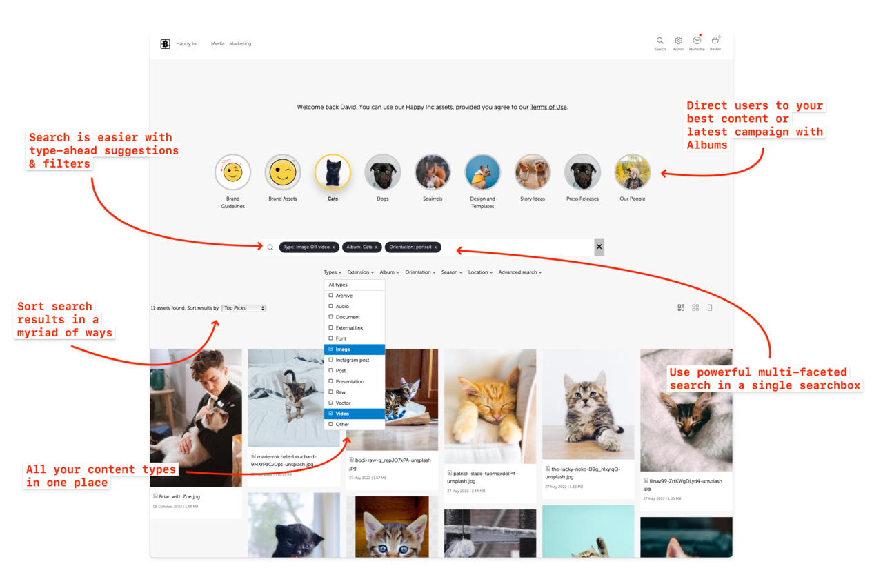
For marketing or feature pages we overlay call-out copy with arrows directly over the image in Cleanshot.
For marketing and help articles we might call out specific details - sometimes with overlays and sometimes without.
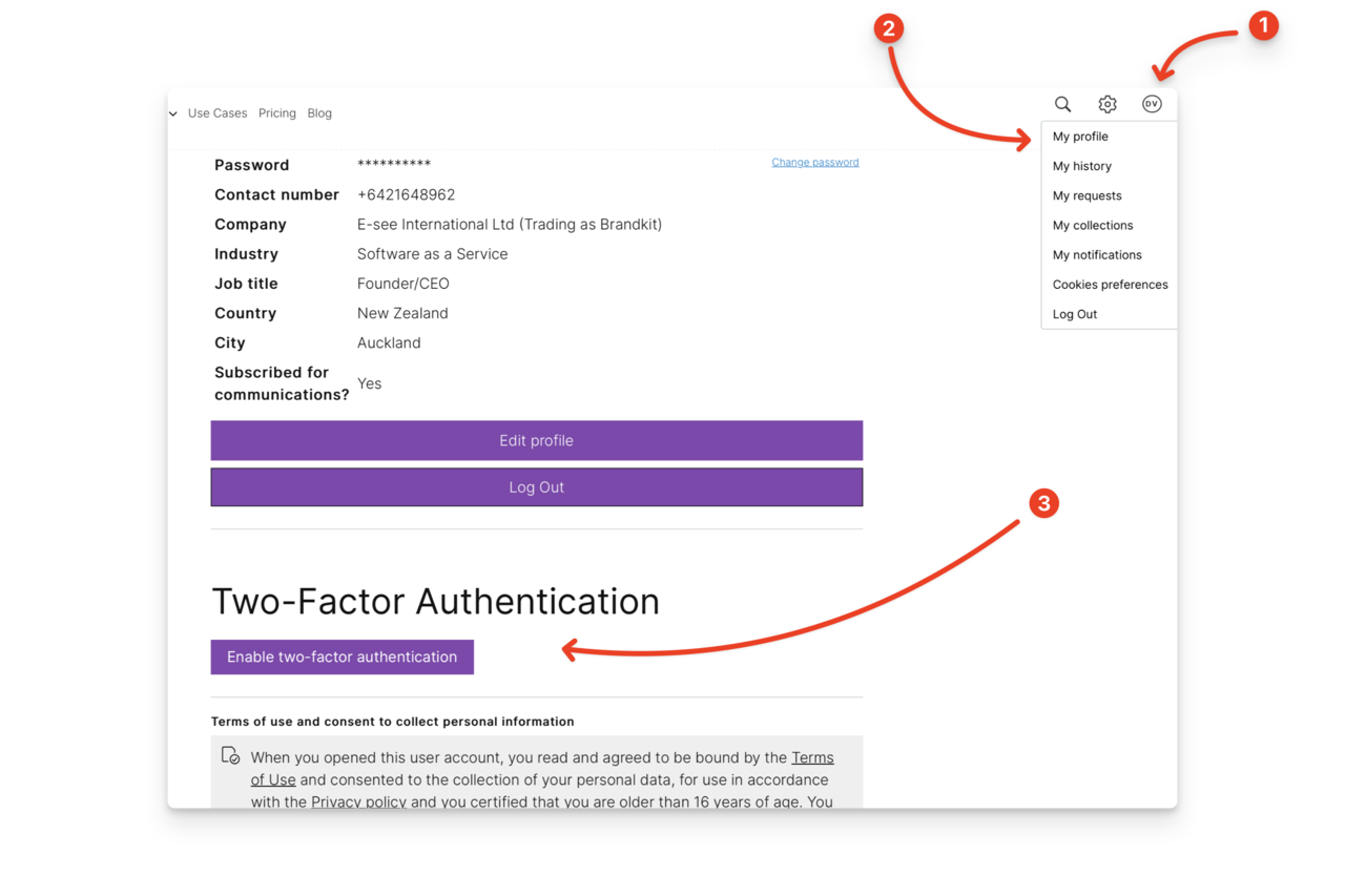
For help articles and explanations we often use numbered call outs. Generally we don't use this style for marketing pages or important features.
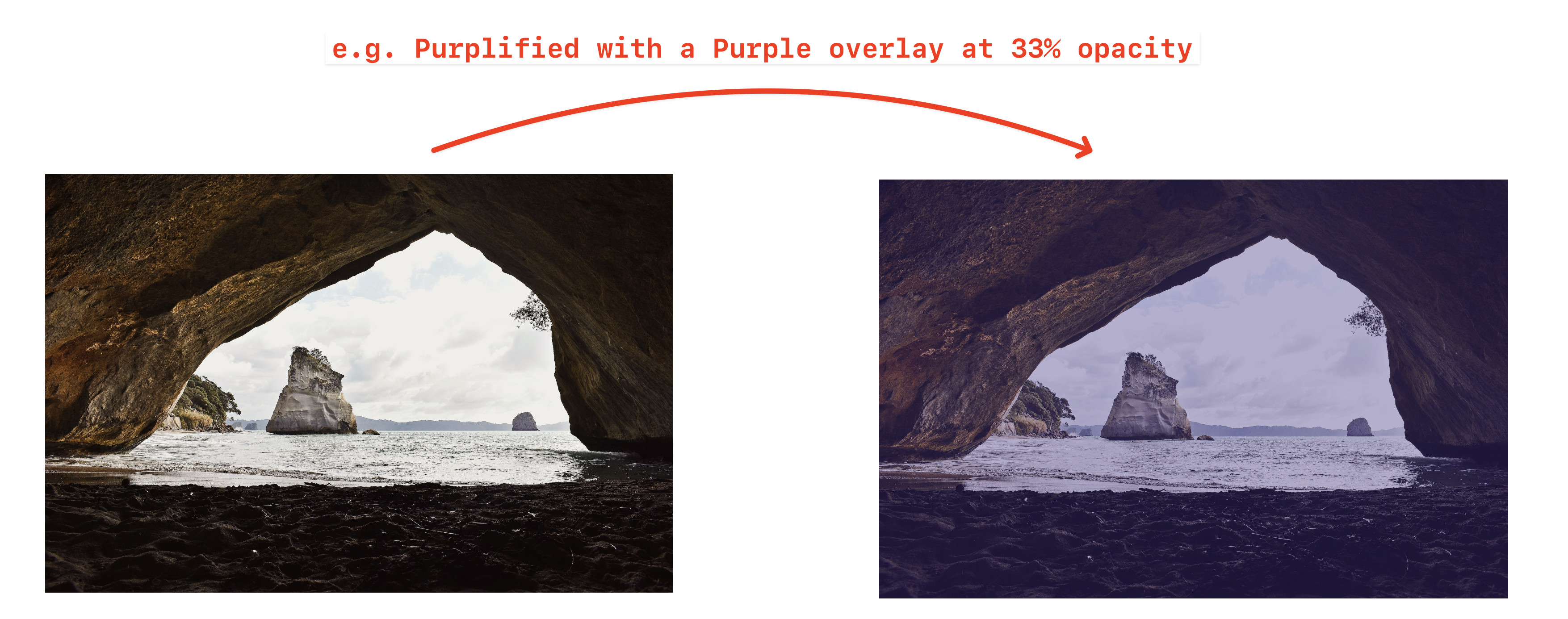
Generally we don't edit photography because we want to portray something authentically and honestly.
However when we create social media images or an Ad, where a logo or text is overlaid we want a darker image (for white text) with a "Brandkit" aesthetic using Brandkit purple or for black text using Brandkit Yellow.
We achieve this by applying a coloured overlay with opacity set between 10% to 33% adjusted by eye to give a subtle yet distinguishable purple or yellow hue/tone to images. It should make the logo or text overlay more legible by providing a bit more contrast. Adjust as needed for each situation.
See examples of approved usage of the brand identity and suitable image and colour themes here.
REGISTERED TRADEMARK: The Brandkit trademark is registered in USA, United Kingdom, Europe, Australia and New Zealand. Use the registered symbol (®) whenever displaying the Logo Lockup (Icon plus Workdmark) in these markets.
TRADEMARK: Use the trademark symbol (™) when displaying either the logo or wordmark on its own (not the lockup), or in copy, or when using the Logo Lockup in markets other than USA, UK, EU, Australia and New Zealand.
COPYRIGHT: All content must be original or properly licensed.
Please contact us if you have any questions.
Your story matters. Help your collaborators find your content, tell your story with confidence, and build a stronger brand.
All for a reasonable and fair price starting at US$99/mth. See pricing here.
Subscribe to Updates Tour Book a Demo
Statistics above last updated 1 March 2024